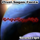
Sinescript
Sinescript is an alien-writing font based on the ‘cursive’ version of the Techtonese text from the “Alien Nation” franchise. Includes all canon characters, numerals, and a few additional fandom characters.
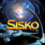
Sisko
Sisko is an angular science-fiction face based heavily on the title logo from Paramount’s Deep Space Nine series. Includes full alphabet, extended punctuation, euro. Includes regular, bold, italic, and bold-italic weights.

Solitarium
This dramatic typeface is based on the “Robot Masters” logo from Takara’s Transformers line. Includes full alphabet, flourished capital letters, euro, extended punctuation. Includes regular and italic versions. Version 1.20 […]
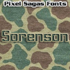
Sorenson
Sorenson is a tall, technological looking font with a minor ‘stencil’ flavor etched into the various glyphs. Includes full alphabet, extended punctuation, euro. Includes regular and italic faces.
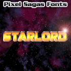
Starlord
Starlord is a thick, angular font loosely based on the title logo of Marvel’s Guardians of the Galaxy movie. Includes full alpha-numerics, extended punctuation, and Euro. Comes in regular and […]
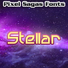
Stellar
This techno-glyph typeface is based on the lettering of the “Colony Wars” series of games. Includes full alphabet, extended characters, euro. Includes italic, bold, bold-italic and expanded versions of each. […]
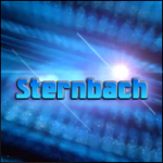
Sternbach
Sternbach is inspired by the title logo of the Star Trek: The Next Generation television series from CBS/Paramount Pictures. Includes full alphabet, extended punctuation, and Euro. The type face includes […]
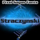
Straczynski
This bold typeface is based on the opening credits for the classic television series “Babylon 5”. Includes full alphabet, punctuation, extended characters, euro. Includes bold and italic versions. Version 1.1 […]
The Copyright and Trademark statements are within the fonts, and terms of license are given in the license document within each font’s zip archive. I’m certainly NOT providing anyone with my legal registration information, of course. So I’m not entirely sure what you’re asking for.
I think something is wrong with the metadata in Mons Olympia Bold fonts. They are listed with “regular” weight. Looking at Roddenberry the bold fonts have a weight of “bold”.
I’m a little unsure about how to set the meta-data for some fonts because it’s not as explicit as ‘bold should be bold’, but is actually a measure of how horizontally thick a stroke is – and even that is inconsistent. As soon as I figure out what the standard’s supposed to be (it’s primarily used for font-replacement), I’ll use it in future versions of each font.
Are there any plans for a version of Montalban as a hollow/outline style, or adding roman numberals as in “II”?
Like the text “STAR TREK II” in the Star Trek II opening credits?