
Trek Arrowheads
Trek Arrowheads is a symbol font based on the numerous Federation Arrowheads that show up in the various incarnations of the Star Trek franchise. Includes designs ranging from the original […]

Turok
This harsh, thick, angular face is based on the title logo of the “Turok” video game franchise from Propaganda Games. Includes full alphabet, punctuation, and Euro. Includes regular and italic […]
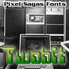
Twobit
Twobit is based on the ‘retro-futuristic’ of computer and technology advertising of the 1960s and early 1970s. Includes full alphabet, punctuation, euro. Includes regular, bold, italic, and bold-italic versions.

Virtucorp
Virtucorp is a simple, heavy, ‘corporate tech’ style typeface based loosely on a number of fictional company logos in movies set in the ‘near future’. The face includes the full alpha-numerics, […]
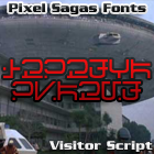
Visitor Script
Visitor Script is an alien typeface based on the alien writing seen in the various incarnations of the “V” franchise. Includes all canonical glyphs.
Yddirian
Yddirian is an unusual “alien glyph” font based loosely on the modern handwritten Hebrew alphabet along with borrowed vowels (considered for traders and other lower-status peoples) and Arabic numerals. Custom […]

Zebulon
Zebulon is a science-fiction themed face based on the title logo of TSR’s classic Star Frontiers game series. Includes full alphabet, extended characters, Euro. Includes condensed, bold, italic, bold-italic, hollow […]

Zentran
Zentran is a modern ‘technical manual’ take on the Zentreadi language that showed up in the legendary Macross (or Robotech) animated series. This version is updated from Geidi Prime’s own […]
The Copyright and Trademark statements are within the fonts, and terms of license are given in the license document within each font’s zip archive. I’m certainly NOT providing anyone with my legal registration information, of course. So I’m not entirely sure what you’re asking for.
I think something is wrong with the metadata in Mons Olympia Bold fonts. They are listed with “regular” weight. Looking at Roddenberry the bold fonts have a weight of “bold”.
I’m a little unsure about how to set the meta-data for some fonts because it’s not as explicit as ‘bold should be bold’, but is actually a measure of how horizontally thick a stroke is – and even that is inconsistent. As soon as I figure out what the standard’s supposed to be (it’s primarily used for font-replacement), I’ll use it in future versions of each font.
Are there any plans for a version of Montalban as a hollow/outline style, or adding roman numberals as in “II”?
Like the text “STAR TREK II” in the Star Trek II opening credits?