
Dancetech
Dancetech is a simple, lightly-chiseled face commonly found on ‘dance mix’ and ‘beat mix’ albums of the late 1990s to early 2000s and presents a simple, bold face perfect for […]

Datashift
Datashift is a simple, strong science-fiction font based loosely on Bandai’s various SD Gundam combat games’ logo. Includes extended character set, punctuation, euro. Includes bold and italic versions.

Directive Four
Directive Four is a simple, thin, LCD-based typeface loosely based on the faux computer graphics used in various movies over the years. The face includes the full alpha-numerics, extended punctuation, […]

Domelen
Domelen is a thick, smooth, LCD-based, ‘small caps’ typeface heavily influenced by early 1980s science-fiction logos. Includes full alphabet, extended punctuation, Euro. Includes bold, italic, and bold-italic faces.
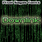
Downlink
Downlink is a techno-themed font that is perfect for any modern or post-modern cyberpunk setting. It is based on a strong, modern LCD style. Includes complete alphabet, Euro, punctuation, stock European […]

Dukat
Dukat is a stylized ‘LCD-style face’ heavily based on the episode titles of Paramount’s Star Trek: Deep Space Nine television series. Includes full alphabet, numerals, and extended punctuation. Available in regular, […]

Dynotherm
Dynotherm is a sharp-edged, angular typeface based on letting found on science-fiction marquees and magazines through the 1960s and 1970s. Includes full alphabet, extended punctuation, Euro. Includes bold and italic […]

Emotion Engine
Emotion Engine is a thin, LCD-based typeface is heavily influenced from on the Playstation 2 logo from Sony Entertainment. Includes full alphabet, extended punctuation, Euro. Includes bold, italic, and bold-italic faces.

Energon
Energon is a heavy LCD-like font based on the logo of Hasbro’s “Transformers: Energon” toyline from 2004-2005. Includes full alphabet, numerics, punctuation, Euro, and accent glpyhs. Regular and Italic versions […]
The Copyright and Trademark statements are within the fonts, and terms of license are given in the license document within each font’s zip archive. I’m certainly NOT providing anyone with my legal registration information, of course. So I’m not entirely sure what you’re asking for.
I think something is wrong with the metadata in Mons Olympia Bold fonts. They are listed with “regular” weight. Looking at Roddenberry the bold fonts have a weight of “bold”.
I’m a little unsure about how to set the meta-data for some fonts because it’s not as explicit as ‘bold should be bold’, but is actually a measure of how horizontally thick a stroke is – and even that is inconsistent. As soon as I figure out what the standard’s supposed to be (it’s primarily used for font-replacement), I’ll use it in future versions of each font.
Are there any plans for a version of Montalban as a hollow/outline style, or adding roman numberals as in “II”?
Like the text “STAR TREK II” in the Star Trek II opening credits?