
Jhiaxus
Jhiaxus is a simple, thick typeface inspired from Hasbro, Inc.’s Transformers: Generation Two franchise. This font includes full alphabet, extended punctuation, and Euro. The left and right brackets have been […]
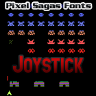
Joystick
This retro-styled typeface is based on the lettering used from Sears’ Tele-Games cartridges (rebranded Atari 2600 games). Includes full alphabet, extended characters, euro. Includes bold and italic versions. Version 1.2 […]

Kanno
Kanno is based heavily upon the title logo for the Macross Plus OVA series and named after the lead vocalist and composer, Yoko Kanno, who made that series exceptional. Includes […]

Kaplah
Kaplah is a simple, angular style based heavily on the “Klingon Interface” from Microprose’s Birth of the Federation computer game. Includes full alpha-numerics, extended punctuation, Euro. Includes regular and italic weights. […]
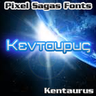
Kentaurus
Kentaurus is a ‘tech manual’ style version of the classic Greek lettering, based on the Tech Manual’s Kentaurus colony writing. It is designed as a ‘letter-replacement’ code-font, with letter glyphs […]
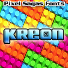
Kreon
Kreon is a thick, decorative typeface that is based on the logo of Hasbro Inc’s “Kre-O” building-brick line. Includes full alphabet, Euro, and accent symbols. Includes regular, italic, condensed, and condensed […]

Laser Rod
This font is based on the “Laser Cycle”, “Laser Rod” part of Hasbro’s Generation Two toyline. Includes full alphabet, numerals, extended characters and Euro. Left and right brackets have been […]

Maximize
Maximize is based on the title logo of Hasbro’s Transformers: Beast Machines franchise. This is a simple, angular header typeface with minor angled flourishes on many of the letters. Includes […]
The Copyright and Trademark statements are within the fonts, and terms of license are given in the license document within each font’s zip archive. I’m certainly NOT providing anyone with my legal registration information, of course. So I’m not entirely sure what you’re asking for.
I think something is wrong with the metadata in Mons Olympia Bold fonts. They are listed with “regular” weight. Looking at Roddenberry the bold fonts have a weight of “bold”.
I’m a little unsure about how to set the meta-data for some fonts because it’s not as explicit as ‘bold should be bold’, but is actually a measure of how horizontally thick a stroke is – and even that is inconsistent. As soon as I figure out what the standard’s supposed to be (it’s primarily used for font-replacement), I’ll use it in future versions of each font.
Are there any plans for a version of Montalban as a hollow/outline style, or adding roman numberals as in “II”?
Like the text “STAR TREK II” in the Star Trek II opening credits?