Red World
Red World is a custom commission monster-age science-fiction-based typeface. It features a tall, narrow structure with sharply-rounded curves. Includes full alphabet, extended punctuation, Euro. Includes bold, italic, and bold-italic faces.
Regen
Regen is a simple science-fiction font based on the logo used on the cover of the IDW Transformers: Regeneration One comics by Simon Furman. Includes full alphabet, extended punctuation, Euro.…
Roddenberry
Roddenberry is Pixel Saga’s version of the ever popular title logo of the original Star Trek television series, created by Gene Roddenberry for Desilu and NBC. This font includes full…
RPM
RPM is a stylized LCD face based on the character titles of Hasbro’s short-lived RPM (robot Powered Machines) line. Includes full alpha-numerics, euro, and extended punctuation. Includes regular, bold, italic,…

Rubcap Autobot and Decepticon
Rubcap Autobot and Rubcap Decepticon have the “Optimus” typeface capitals centered inside the ‘hollowed-out’ versions of the Autobot or Decepticon insignia from Hasbro’s Transformers line.
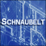
Schnaubelt
Schnaubelt is heavily based on the typeface of the drawing stencil used on the Star Trek: Technical Manual. It is a simple, clean “small-caps” engineering face commonly found on blueprints. This font includes full…

Sigma Five
Sigma Five is a collection of fonts is a bold, heavy face based on science-fiction lettering made famous by Star Wars and used in numerous franchises since. Includes a “regular”…
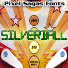
Silverball
This font is based on the LCD text used in many late 1980s and 1990s arcade pinball games. It includes the international accent expansions, the Euro, as well as a…
The Copyright and Trademark statements are within the fonts, and terms of license are given in the license document within each font’s zip archive. I’m certainly NOT providing anyone with my legal registration information, of course. So I’m not entirely sure what you’re asking for.
I think something is wrong with the metadata in Mons Olympia Bold fonts. They are listed with “regular” weight. Looking at Roddenberry the bold fonts have a weight of “bold”.
I’m a little unsure about how to set the meta-data for some fonts because it’s not as explicit as ‘bold should be bold’, but is actually a measure of how horizontally thick a stroke is – and even that is inconsistent. As soon as I figure out what the standard’s supposed to be (it’s primarily used for font-replacement), I’ll use it in future versions of each font.
Are there any plans for a version of Montalban as a hollow/outline style, or adding roman numberals as in “II”?
Like the text “STAR TREK II” in the Star Trek II opening credits?