
Eurocorp
Eurocorp is based on the heavily-stylized lettering found in the classic Syndicate game from Bullfrog Interactive. The face features a sharp, angular look distressed by circuitry patterns. Includes full alphabet,…
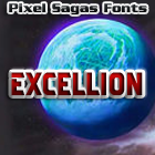
Excellion
Excellion is a science-fiction themed font based on Hasbro’s “Transformers: Cybertron” logo. This font includes full alphabet, punctuation, extended European character set, Euro. The family includes regular and italic versions. Note: The Excellion…

Flipbash
Flipbash is loosely based on the logo of Hasbro’s “Bot Shots” line, this is a bold, squarish font useful for simple ‘tech’ displays. Includes regular character set, Euro, and accented…

Flynn
Flynn is a sci-fi typeface is based on the title logos of “Tron” and “Tron: Legacy” from Walt Disney pictures. Includes basic alphabet and symbols. Includes hollow and italic versions.…

Fontana
Fontana is based on the Pocket Books titling for their Star Trek novels through the 1970s and most of the 1980s. Includes accent characters, extended punctuation, and Euro. Includes bold…
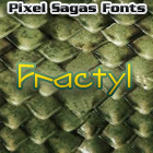
Fractyl
This decorative typeface used for the Predacons’ speaking bubbles in the BotCon “Ground Zero” comic in 1997. Includes full alphabet, extended characters, and Euro. Includes bold and italic versions.

Gaiking
Gaiking is based on the logo of Mattel’s infamous “Giant Robot” toyline, “Shogun Warriors”. This font includes full alphabet, accent characters, and Euro. Includes italic and extended versions.
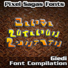
Giedi Prime Font Collection
This collection is an archive of Jim Sorenson’s symbol fonts based on writing found in Robotech and Transformers. The fonts include “Ancient Autobot”, “Decepticon Graffiti”, “Golden Disk”, “Maximal”, “Predacon”, and…
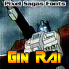
Gin Rai
This heavy-weighted typeface is based on the logo of Hasbro’s latter-era “Generation One” Transformers series. Includes regular and italic versions.
The Copyright and Trademark statements are within the fonts, and terms of license are given in the license document within each font’s zip archive. I’m certainly NOT providing anyone with my legal registration information, of course. So I’m not entirely sure what you’re asking for.
I think something is wrong with the metadata in Mons Olympia Bold fonts. They are listed with “regular” weight. Looking at Roddenberry the bold fonts have a weight of “bold”.
I’m a little unsure about how to set the meta-data for some fonts because it’s not as explicit as ‘bold should be bold’, but is actually a measure of how horizontally thick a stroke is – and even that is inconsistent. As soon as I figure out what the standard’s supposed to be (it’s primarily used for font-replacement), I’ll use it in future versions of each font.
Are there any plans for a version of Montalban as a hollow/outline style, or adding roman numberals as in “II”?
Like the text “STAR TREK II” in the Star Trek II opening credits?