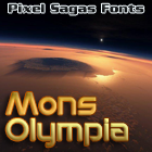
Mons Olympia
Mons Olympia is based on the classic lettering of Walt Disney’s famous “Space Mountain” ride. This retro-science-fiction typeface includes full alpha-numerics, extended punctuation and euro and comes in regular, bold,…
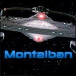
Montalban
Montalban is a bold display face based heavily on the title and end-credits from the legendary Star Trek II: The Wrath of Khan movie. Includes full alphabet, extended punctuation, euro. Includes…

Nakadai
This wide technological font is based on the character lettering for Hasbro’s new Transformers: Prime figures. Includes lower case alphabet, accented characters, and Euro. Includes italic version.
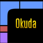
Okuda
Okuda is a tall and thin typeface based on the computer lettering (the LCARS system) created by Mike Okuda for Star Trek: The Next Generation. Includes full alphabet, extended punctuation,…
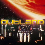
Outland
Outland is based on the corporate and naval signage lettering found in Sean Connery’s early 1980s movie Outland. Includes full alphabet, extended punctuation, Euro. Includes regular, italic, bold, bold-italic, black,…
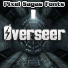
Overseer
Overseer is a simple, bold typeface based on the title logo for Bethesda Softwork’s legendary Fallout franchise, down to the lightning-flourished ‘o’. Includes full alphabet, lower case, accent characters, and…
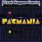
Pacmania
This famous typeface is based on the original logos of the Pac-Man franchise from Namco Inc. Includes full alphabet, euro, extended punctuation. Includes regular and italic faces. Update: 17 August…
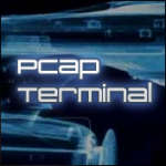
PCap Terminal
PCap Terminal is Pixel Saga’s version of some of the computer text seen in the JJ Abrams Star Trek motion picture series. This is an LCD-style face with exaggerated lower-case letters…
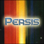
Persis
Persis is a science-fiction font based on the subtitle logos of the Star Trek: The Motion Picture movie… Includes full alphabet, numerals, extended punctuation, euro. Includes regular, bold, italic, and bold-italic…
The Copyright and Trademark statements are within the fonts, and terms of license are given in the license document within each font’s zip archive. I’m certainly NOT providing anyone with my legal registration information, of course. So I’m not entirely sure what you’re asking for.
I think something is wrong with the metadata in Mons Olympia Bold fonts. They are listed with “regular” weight. Looking at Roddenberry the bold fonts have a weight of “bold”.
I’m a little unsure about how to set the meta-data for some fonts because it’s not as explicit as ‘bold should be bold’, but is actually a measure of how horizontally thick a stroke is – and even that is inconsistent. As soon as I figure out what the standard’s supposed to be (it’s primarily used for font-replacement), I’ll use it in future versions of each font.
Are there any plans for a version of Montalban as a hollow/outline style, or adding roman numberals as in “II”?
Like the text “STAR TREK II” in the Star Trek II opening credits?