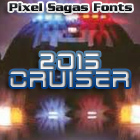
2015 Cruiser
2015 Cruiser is a “cut”, LCD-based typeface based on the police-car lettering used in the move “Back to the Future II”. Includes full alphabet, Euro, extended punctuation. Includes italic, bold, bold-italic, and […]

Algol
Algol is a science-fiction header font is based on the preliminary logo for R Talsorian’s “Mekton Zero” role-playing game. Includes full alphabet, extended punctuation, euro. Includes italic version.
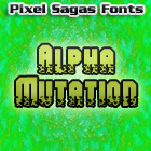
Alpha Mutation
Alpha Mutation is a highly decorative typeface based on the title logo to the 2011 version of “Gammaworld”. This typeface is a tall, ‘military stencil’ font with corrosive etchings marked into […]
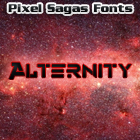
Alternity
This science-fiction-themed typeface is based on title lettering used in TSR’s “Alternity” role-playing game of the mid 1990s. Includes full alphabet, extended punctuation, Euro. Includes regular, bold, italic, and bold-italic […]

Amuro
Amuro is an angular, beveled face based heavily on the heading logos from Bandai’s Dynasty Warriors: Gundam video game. Includes full alphabet, extended punctuation, euro. Includes bold, italic, bold-italic, and condensed versions of […]
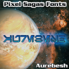
Aurebesh
Aurebesh is based on the legendary Star Wars “Galactic Standard” typeface. This version of the font is based on the old RPG version from West End Games and includes all […]

Bayformance
Bayformance is a simple, bold, technical-based typeface inspired by the title logo from Michael Bay’s Transformers 4: Age of Extinction. Includes full alphabet, punctuation, extended character set, and Euro. Includes italic, bold, and […]
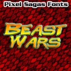
Beast Wars
Beast Wars, as the name implies, is heavily based on the title font used for Hasbro’s Beast Wars toyline and television show – and has been repeatedly used for official Hasbro […]
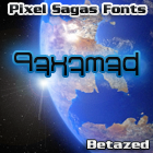
Betazed
Betazed is a fan-commissioned font to give a written-form to the Betazed language as used in Star Trek: The Next Generation. Includes a full alphabet and 10-digit numerical system based […]
The Copyright and Trademark statements are within the fonts, and terms of license are given in the license document within each font’s zip archive. I’m certainly NOT providing anyone with my legal registration information, of course. So I’m not entirely sure what you’re asking for.
I think something is wrong with the metadata in Mons Olympia Bold fonts. They are listed with “regular” weight. Looking at Roddenberry the bold fonts have a weight of “bold”.
I’m a little unsure about how to set the meta-data for some fonts because it’s not as explicit as ‘bold should be bold’, but is actually a measure of how horizontally thick a stroke is – and even that is inconsistent. As soon as I figure out what the standard’s supposed to be (it’s primarily used for font-replacement), I’ll use it in future versions of each font.
Are there any plans for a version of Montalban as a hollow/outline style, or adding roman numberals as in “II”?
Like the text “STAR TREK II” in the Star Trek II opening credits?